Cases / AWARE

AWARE
Aware is an app for personal growth, run by the 29k Foundation. Through evidence-based exercises, meditations, personal reflections, and conversations with others, it helps users develop a deeper connection with and understanding of themselves, others, and the world around them.
The challenge
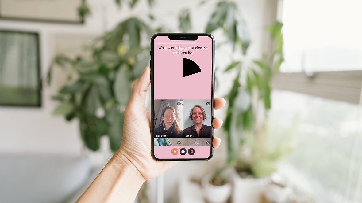
The team behind Aware sees the greatest impact and user satisfaction after their facilitated live sessions – group exercises conducted online under the guidance of a session host.
However, the threshold to participate is high.
Our task was to gather insights about their target audience in order to understand how this threshold to participation could be lowered.
The result
In the end, we were left with a set of solutions grounded in insights from research and usability testing. This was a valuable learning experience where I not only gained a deep understanding of the users through different research methods, but also learned how to communicate these insights effectively to the client.
I realized that users hold the answers, and as a UX Designer, it is my responsibility to ask the right questions to uncover them. I also learned that design is inherently subjective – even when following established principles, only by testing ideas with users can we know if they truly work. Finally, I understood the importance of presenting insights to the client, since the way they are communicated can influence which decisions are prioritized, and because it allows me to justify my design choices with actual user data.
The project
Learning module
UX Research
Service Design
Usability testing
Timeframe
14 weeks
My role
UX Researcher
UX Designer
Service Designer
Tools
Figma
Fig jam
Figma slides
The design process
UX Research
Experience map
User studies
Synthesis of insights
Behavior types
Service Design
Workshops
Prototyping
Usability testing
Guerilla testing (preference testing)
Observations
UX Research
Start with why
We started by holding a workshop together with AWARE to define the target group WHO , the experience HOW , and the purpose WHY . We then created an experience map that gave us a clear direction throughout the design process and guided us further into the user studies.

UX Research
User studies
We used in-depth interviews combined with observations to empathize with and gain a deep understanding of our target group. We interviewed both existing AWARE users and people within the target group who were not yet using the app.
Our goal was to understand their motivations, behaviors, and attitudes toward working on their mental health. We also asked specific questions about the live session concept. In total, we interviewed 19 people, of which 8 non-users were also observed in an onboarding format.

UX Research
Insights
-
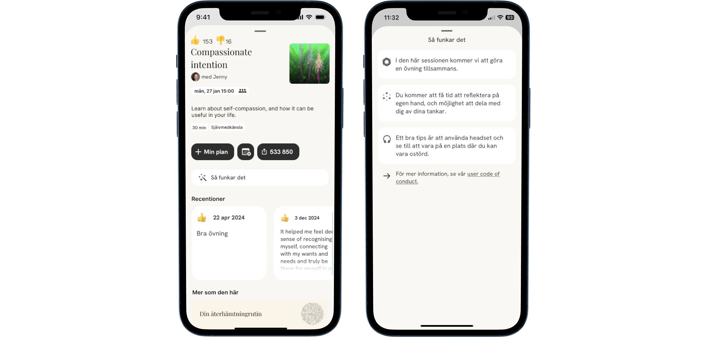
None of the eight observed participants understood that the 'Min plan/My plan' button was to be used to register their interest in a live session. The sharing code was also misunderstood – everyone thought the numbers indicated how many people had previously participated in the session.
For more information, users could click the 'Så funkar det/How it works' button, but the icon was perceived as confusing (some guessed it was an AI feature). However, this did not stop them from clicking.
Most felt that the information provided was sufficient, but when asked to describe a live session, several misunderstandings emerged. The most common was the belief that the exercise itself was live rather than pre-recorded. Many also expected a lecture format without interaction between participants.
-
AWARE refers to studies showing that mental health exercises in groups have a greater effect than individual exercises. However, this information is not communicated clearly enough in the app.
When we asked our interviewees whether this would increase their motivation to participate in live sessions, the majority answered yes. -
During the session, there is a sharing moment where participants can share their thoughts on the exercise related to the session’s topic, while the session leader and others listen without commenting. However, the majority of interviewees requested more interaction, such as a text chat, feedback from the session leader, and the possibility to ask questions, either during or outside the session.
-
Several interviewees felt that the live sessions were too simplistic and preferred forums with deeper discussions and follow-ups. Suggestions that emerged included recurring themes across multiple sessions, similar to a course, with exercises in between sessions.
UX Research
Behavior types
Based on the results of the user studies, we identified two distinct behavior patterns among our respondents: the Security Seekers and the Progress Seekers. Security Seekers valued safety and control, while Progress Seekers focused on measurable personal development and a clear purpose. With these behavior types in mind, we began designing solutions.


Service Design
Ideation
Through workshops and creative processes, we generated proposed solutions based on the insights we had gathered. The guiding experience words – Human, Meaningful, and Engaging – together with the motivations and needs of our behavior types, served as principles throughout the process.
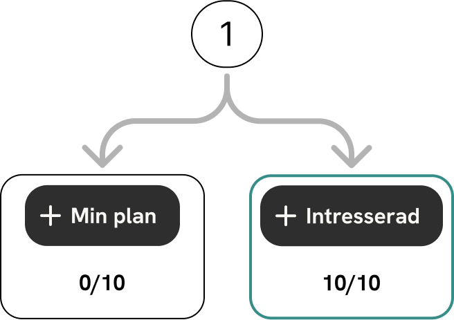
We presented seven solutions for AWARE, which we then prioritized collaboratively based on the target group’s needs and the project’s purpose – lowering the threshold for participating in live sessions. In the end, we focused on the three highest-priority solutions, with the prioritization as follows:
-
Background:
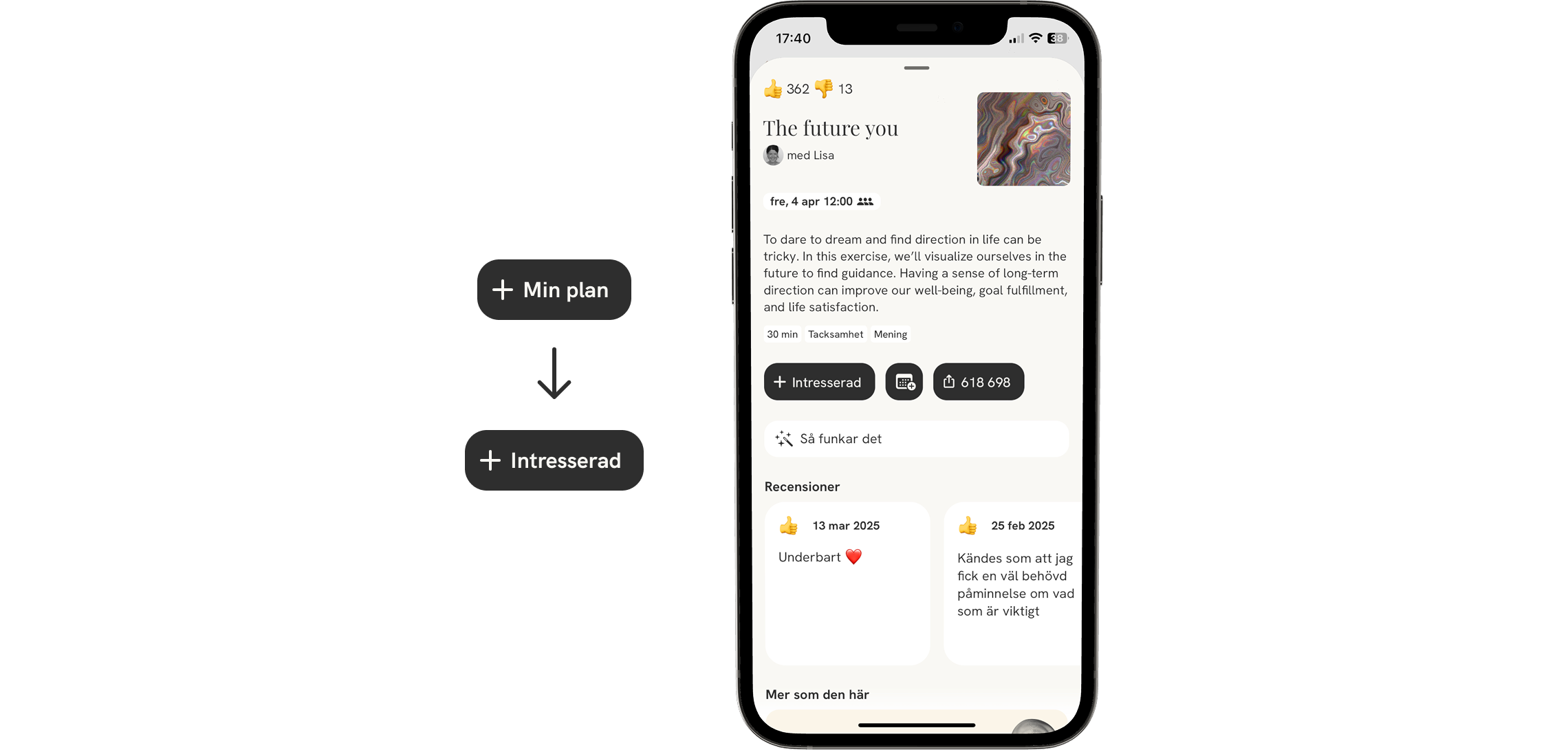
The ‘Min plan/My Plan’ button is not clear enough. Most test users did not understand the button’s purpose – to register their interest in live sessions. This can lead to confusion, frustration, and inefficiency in the user experience.Solution:
The button text will be changed to ‘Intresserad/Interested’ – a clearer and more intuitive description.
-
Background:
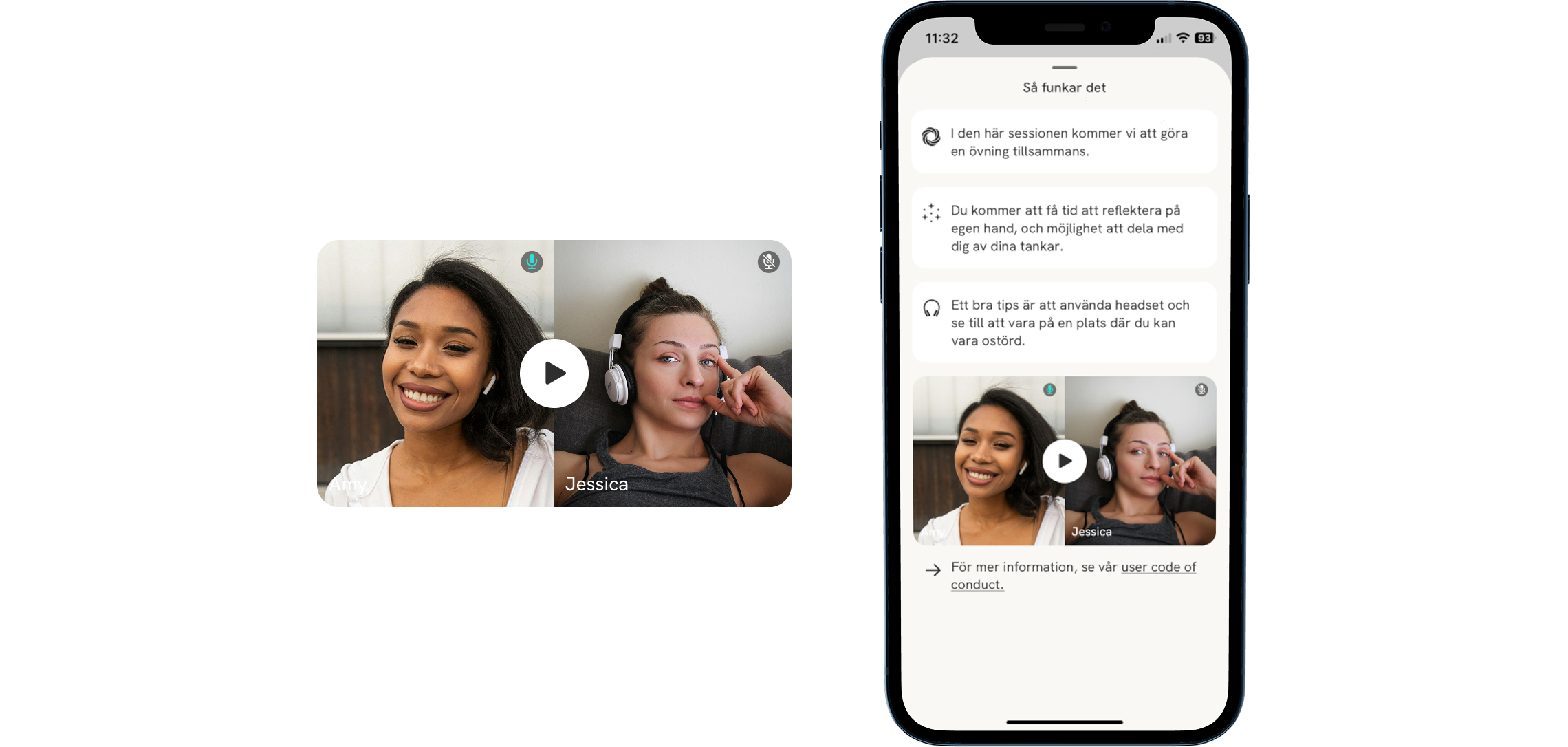
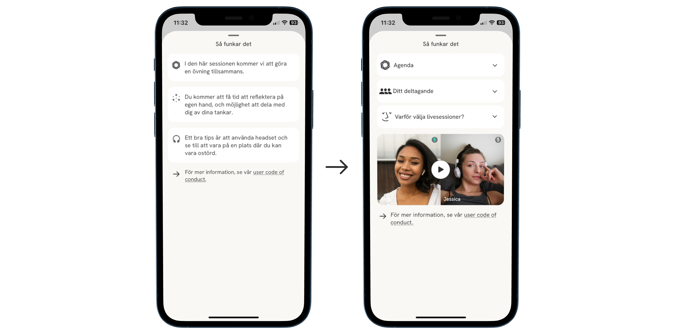
Most interviewees misunderstood the setup of a live session based on the ‘Så funkar det/How it works’ text, which can cause anxiety for users seeking security and frustration for those seeking progression.Solution:
A short, clear video explaining the live session setup. An agenda clarifies expectations, creates structure, and provides a sense of security, while a brief introduction of the facilitator adds trust and reassurance.
-
Background:
Several interviewees requested more information about how a live session works and what is expected of them, even after reading the ‘Så funkar det/How It Works’ text. Lack of clarity can cause anxiety for users seeking security and frustration for those seeking growth.Solution:
Clear and reassuring information on how a live session is conducted.
Explicit guidance on what is expected from participants.
Warm and human tone of voice to create a sense of security.

-
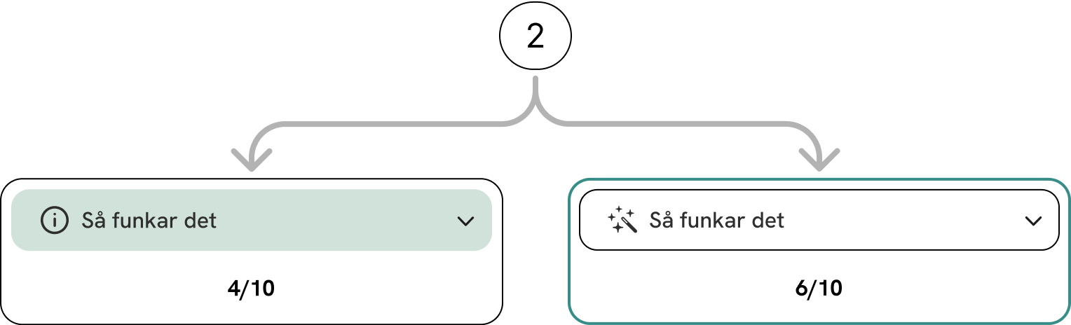
Background:
Several interviewees had difficulty interpreting the icon on the ‘Så funkar det/How It Works’ button, perceiving it as a magic wand or an AI feature.Solution:
The icon will be replaced with an information symbol (‘i’) for increased clarity, and the button color will be adjusted for better visibility. The new icon provides a sense of security through its recognizability.
“By listening to others’ perspectives in a group, we learn new ways of thinking and develop our own understanding.”
-
Background:
Interviews revealed that evidence would strengthen users’ willingness to participate in a live session. It would also increase their sense of security by showing that the exercises are research-based.Solution:
Evidence-based information that provides reassurance, offers new perspectives, and reinforces the sense of progress – balancing security and growth.

-
Background:
Several interviewees lack the ability to track their progression. This absence makes participating in live sessions feel less meaningful.Solution:
Ability to set goals and visually track progress.
Motivation through encouraging messages and animations.

-
Background:
Several interviewees thought the numbers in the share code indicated how many people had completed the respective session.Solution:
Remove the code and replace it with ‘Dela/Share’. This change reduces confusion and, hopefully, encourages more users to participate in live sessions.
Usability testing
Usability testing
To develop and validate our solutions, we conducted usability tests. We compared the previous design with our proposed solutions through guerrilla testing to identify the most intuitive option and evaluate our design choices.
We also conducted five controlled observations, where users were given a scenario and a task. The goal was to assess whether the updated information was sufficient to create a sense of security and increase motivation to participate in live sessions.
The results provided valuable insights into how different users perceive icons and how the presentation of information impacted their overall experience.
-
10 out of 10 participants in a preference test.
-
6 out of 10 participants preferred the existing ‘Så funkar det/How It Works’ button over our updated version in an preferens test. Additionally, 4 of these 6 participants perceived the ‘i’ icon as an error message.
-
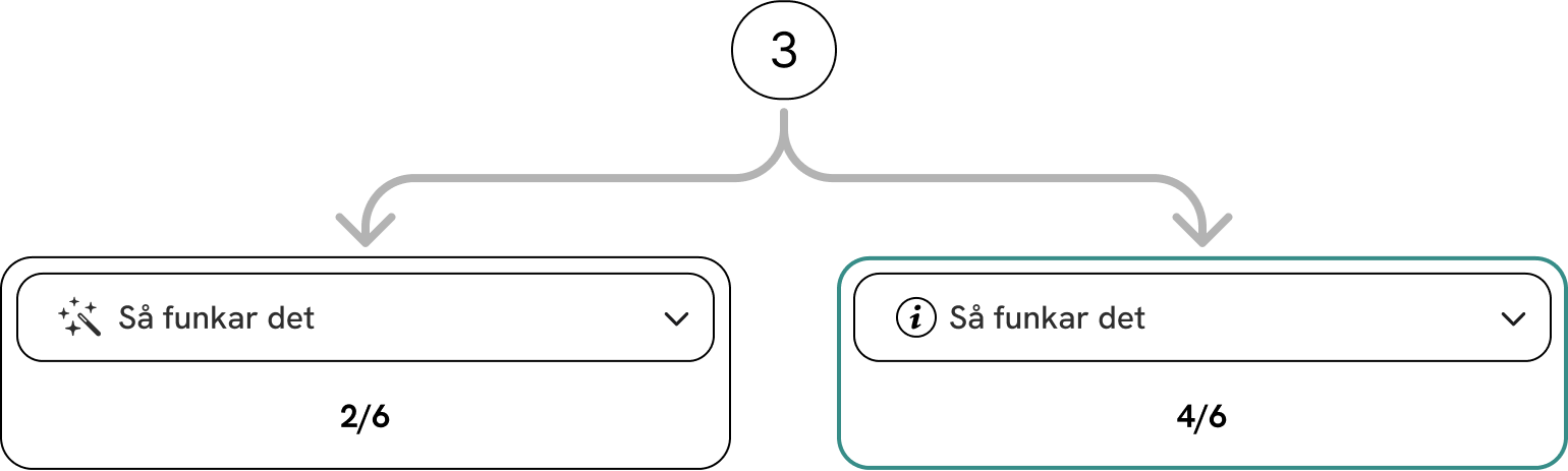
Although the majority in the previous test preferred the original icon, we wanted to test our hypothesis that an information ‘i’ icon is more intuitive. We therefore conducted a new preference test with a different type of ‘i’ icon. We also used the same white background for a fairer comparison. In this test, 4 out of 6 participants preferred the updated ‘i’ icon over the ‘magic wand.

-
Finally, we wanted to test which background color was preferred for the ‘Så funkar det/How It Works’ button with the updated ‘i’ icon. Of the 4 participants who preferred the updated ‘i’ icon in the previous test, all 4 preferred a green background over a white one in a preference test.
-
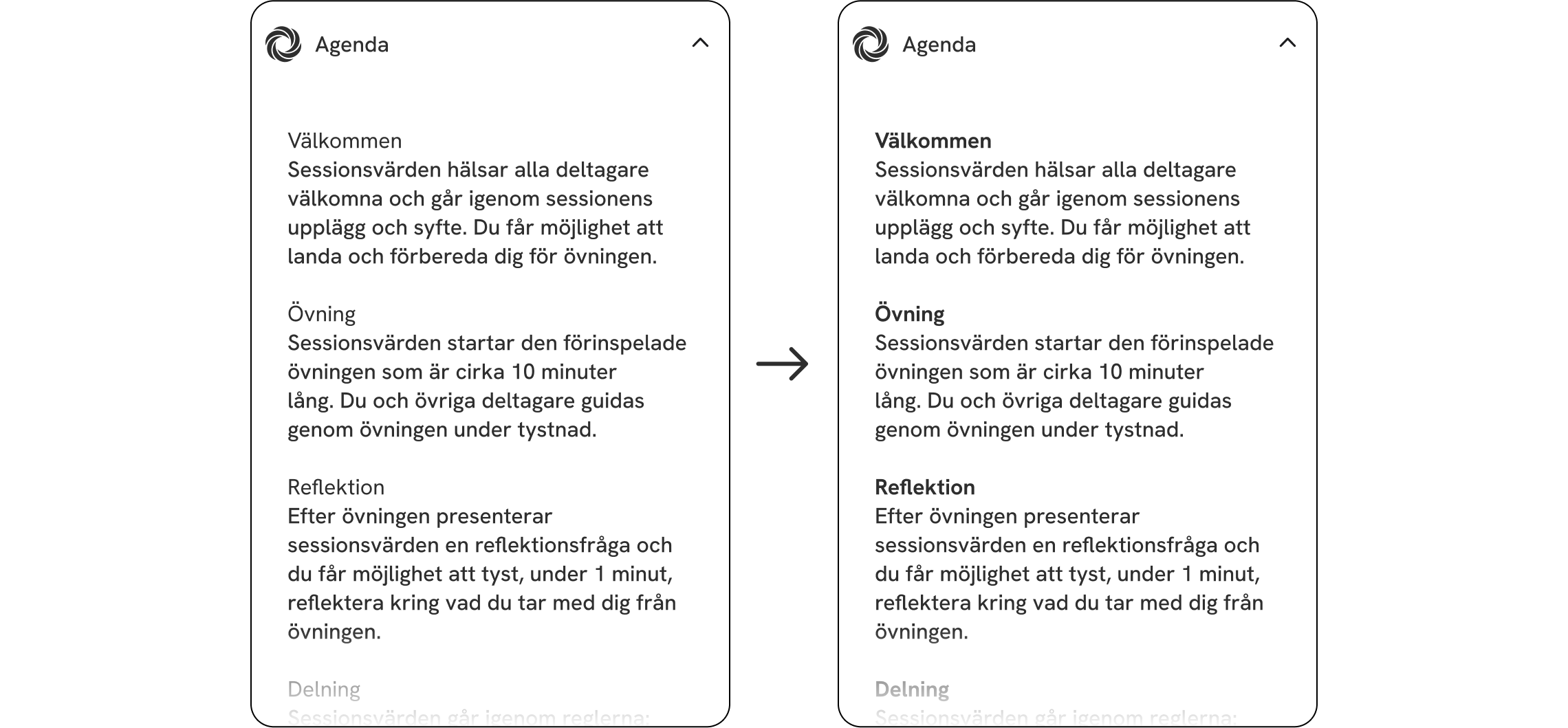
All observed participants perceived the “Agenda” text as clear but lengthy.
Solution:
Use bold headings to clarify text sections.
Shorten the text

-
The ‘Ditt deltagande/Your Participation’ icon was perceived as confusing. Several test participants associated the three ‘avatars’ with the number of people who would attend the live sessions during observation.
Solution:
Change the icon to a single ‘avatar’ to reduce confusion and make the icon more descriptive of its content.
-
All observed participants appreciated the instructional video, but some features were missing. The features mentioned were:
Being able to see the video length.
Being able to open the video in full-screen mode.
Being able to adjust the playback speed.
Showing a participant in the video with their camera off to illustrate that anonymity is an option.
Solutions:
Add a progress bar with visible total length.
Enable full-screen mode.
Provide playback speed options.
Show an example in the video that a participant can have their camera off.
LET'S GET IN TOUCH!
LET'S GET IN TOUCH!
andreas.tjernstrom@hotmail.com
+46700028152