PAGINATION
Redesigning pagination for clarity and accessibility
COMPANY
TIMEFRAME
Naturkompaniet
1 week
MY ROLE
UX/UI Designer
Project description
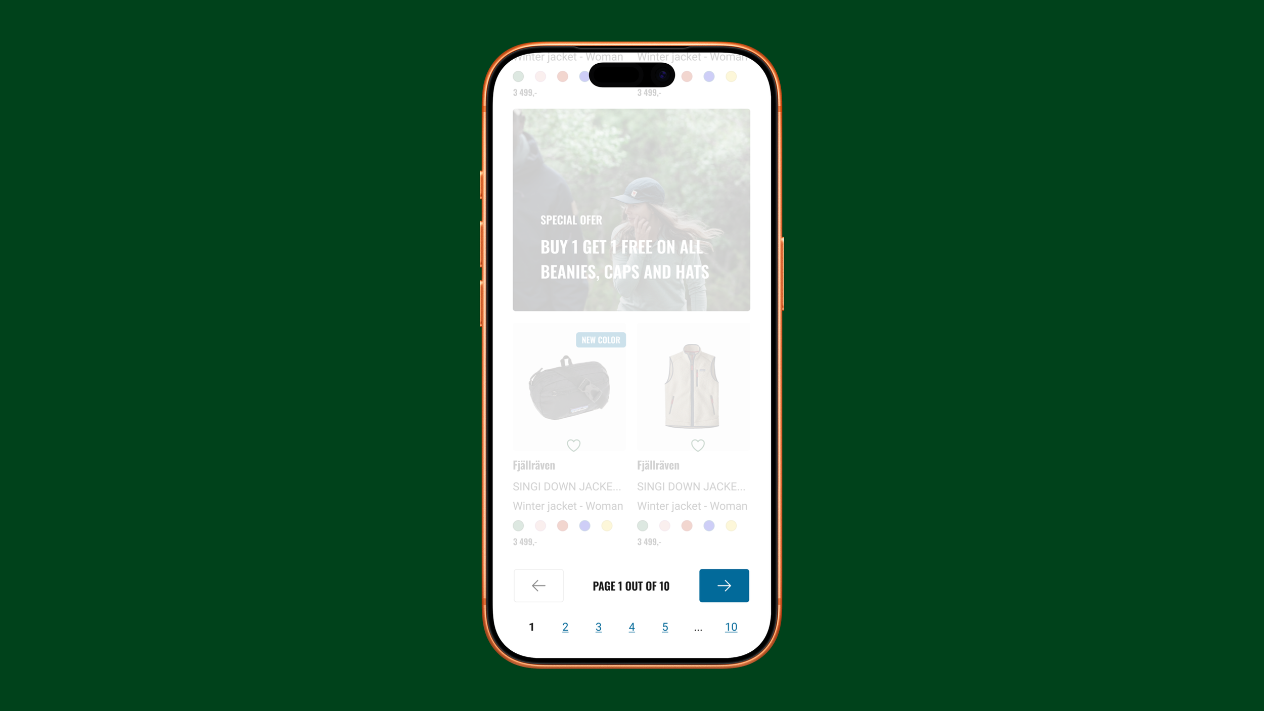
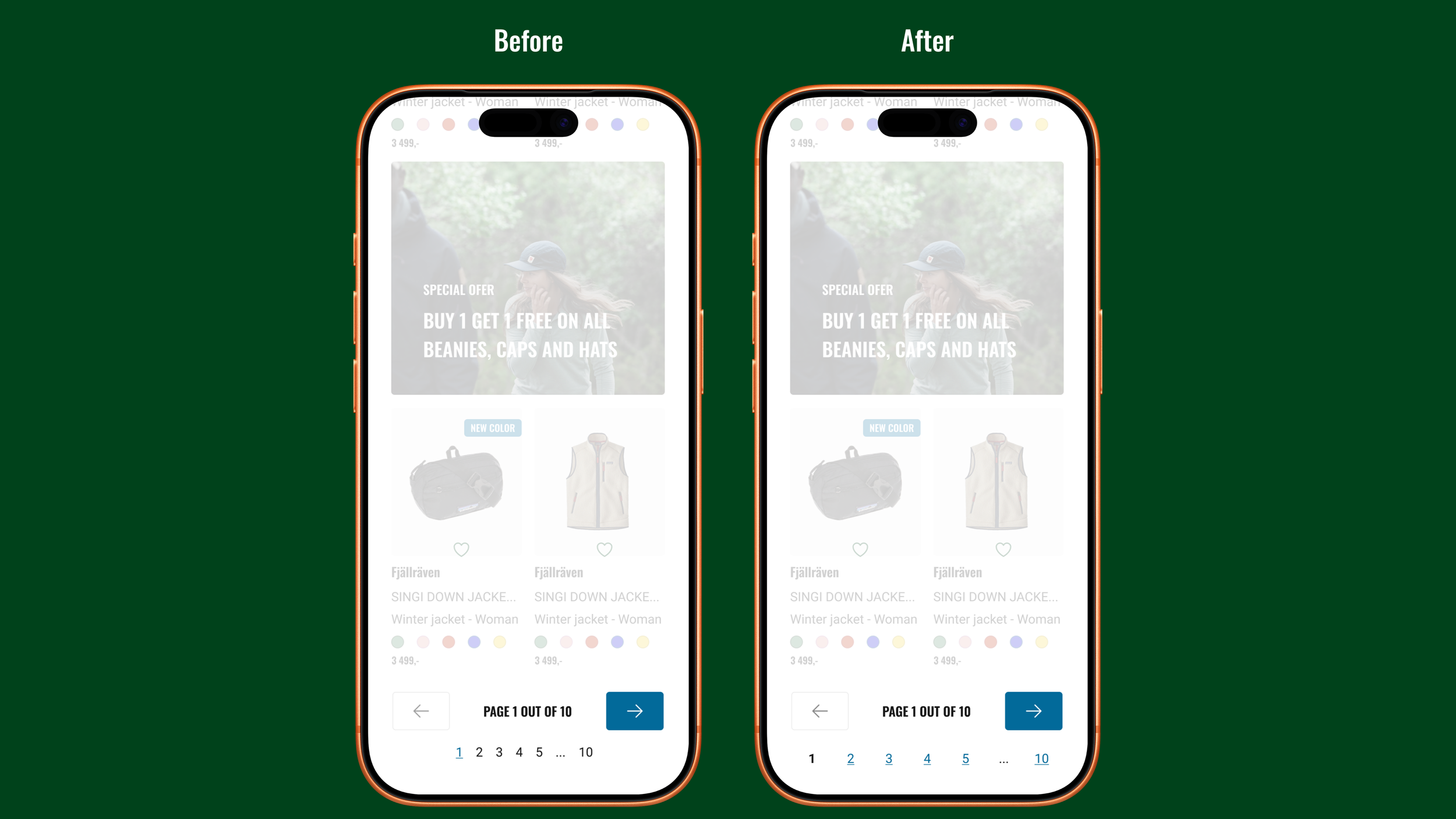
The pagination on Naturkompaniet's e-commerce site had an inverted logic — the active page looked clickable while the actual links looked like plain text. This risked both confusing users and creating frustrating dead-end clicks. Click targets were also too small, raising accessibility concerns.
I was tasked with redesigning the pagination to fix the interaction logic and improve accessibility.
The design process
Research
Design
Implementation
Before jumping into design, I evaluated whether pagination was the right pattern at all. Alternatives like infinite scroll and load more were considered, but given the size of the product catalogue, pagination proved the better fit. Click-rate data from Clarity also confirmed that the arrow icons were frequently used, indicating the pattern worked. The implementation was the problem.
Redesigned and documented the pagination component in Figma, ensuring accessibility throughout.
The finalised design and requirements were documented annd handed off to the development team via Jira.
Solution
The solution focused on correcting the interaction logic, improving accessibility, and giving users a clearer sense of their position within the page range.
Corrected interaction logic
The active page indicator was restyled to reflect current state, while the navigable page numbers were given clear link styling to communicate clickability.
Enlarged click-targets
Bold active page indicator
The click targets were enlarged to meet accessibility standards (WCAG 2.2 AA), making the component easier to interact with for all users.
The active page indicator was made bold, giving users a clearer sense of their current position within the page range.
Result
The redesigned pagination was successfully implemented on Naturkompaniet's e-commerce site. While the arrow icons remained the primary navigation method, the updated component showed a modest improvement in page number interactions — suggesting that the clearer styling and larger click targets made the pattern more discoverable and easier to use.
LET'S GET IN TOUCH!
LET'S GET IN TOUCH!
andreas.tjernstrom@hotmail.com
+46700028152